

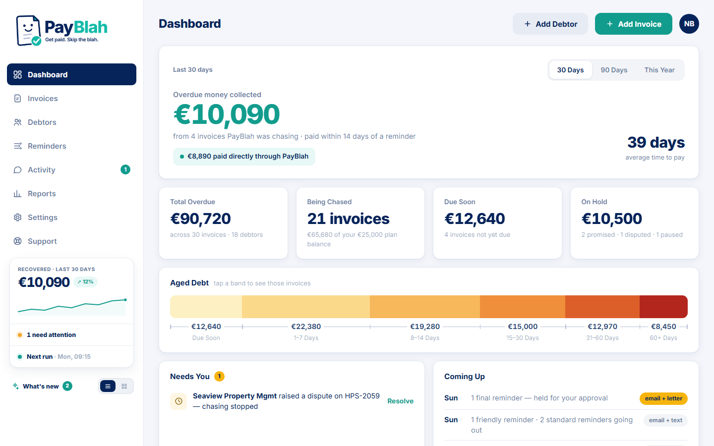
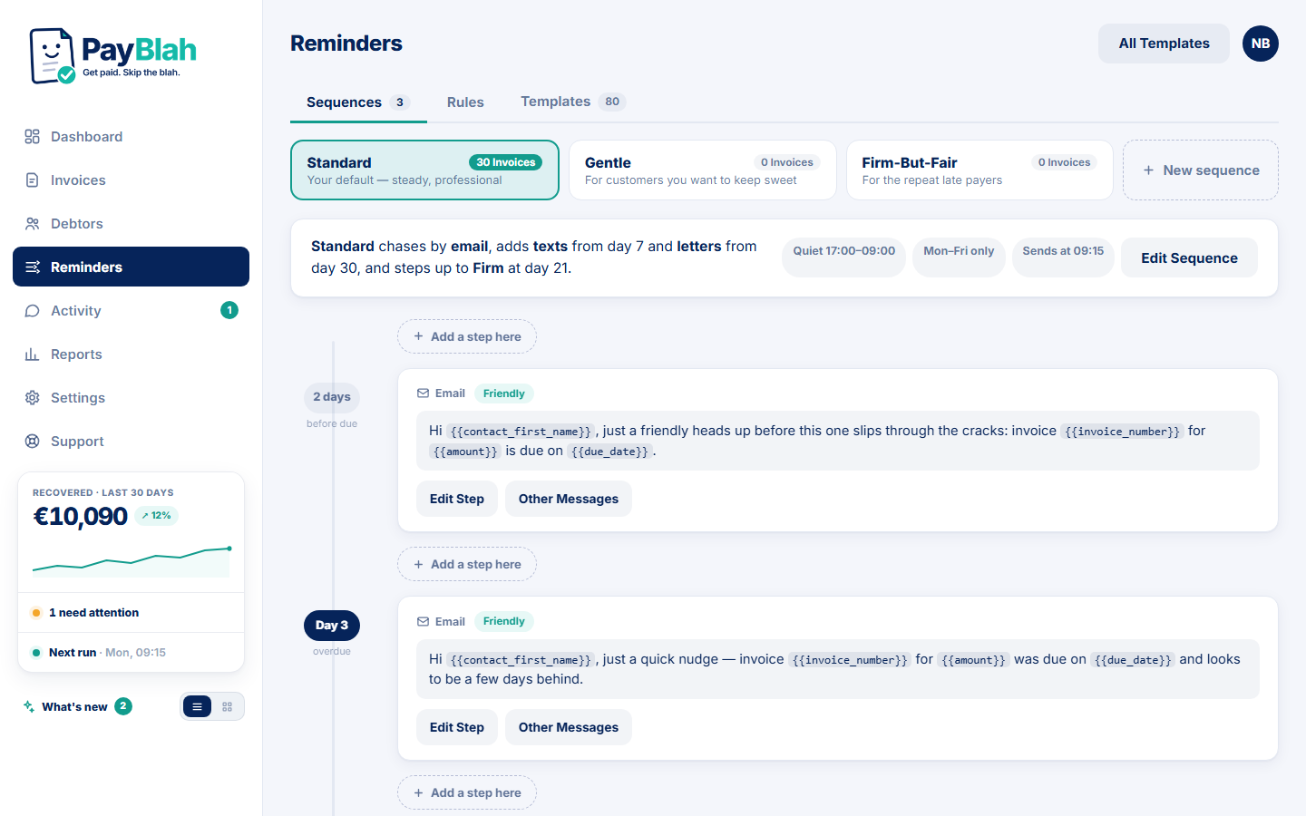
Before code, we locked a full design set for the product: dashboard, chasing, templates, the customer portal, settings, reports and more — argued over until the rule was clear.
Serious financial software, with warmth where warmth helps. Big actions. Honest labels. No carnival UI that pretends collections are a game.
What got locked
The design set covers the surfaces operators live in every day:
- Dashboard with overdue-first honesty (and attribution language we can stand behind)
- Invoice register and customer detail — next action, not just aging
- Workflows and template library
- Customer portal: view, pay, promise — in your branding
- Activity, reports, settings, connect-accounting
Colour follows the brand doc: navy for structure, teal for positive money events, amber when a human must decide. Teal never pretends to be a tiny text colour that fails contrast.
Why it matters for customers
When you open PayBlah after a long day, the product should feel like a calm operator console — not a reminder factory yelling at you. That is the same spirit as the marketing site: clear, adult, and unwilling to invent proof.
Empty states matter as much as full ones. “Nothing overdue. Nice.” is a feature, not a failure of content. Design that celebrates quiet mornings is design that respects operators.
Design is not decoration here
Every pattern that looks “pretty” has a compliance cousin: stop-on-payment, dispute pause, never-chase, audit trail. The UI has to make those obvious, not bury them in a settings dungeon sold as an upgrade.
Walk the product story on Features, see who it is for on Industries, or try a trial when you are ready.
This update describes real product and website work. It is not financial advice, and it does not claim outcomes for any business. Legal pages: Terms, Privacy.